

Rebranding Project
CCV
CCV is a company founded in 1958 by Cor and Bep van de Velden. It started as a small-size accounting firm, and grow to a full-service international payment provider.
The brand needed a rebranding to connect better to the modern market, strengthen its position in the competitive payment industry, and reflect its evolution to an innovative, customer-centric, and future-focused payment solutions provider.
CCV logo evolution
Early 2000s
1958
Mid 2010’s


The CCV rebranding is a 100% in-house project that is initiated by the Marketing & Communications team. As the main designer of this project, I have to make sure that the logo and visual brand reflects CCV’s expertise in payment solutions yet also honouring its legacy and history.
That’s where the timeless bold design with a striking blue dot that modernizes the old CCV blue. A decision also has been made by the Marketing & Communications team with the approval of then CCO, Enny van de Velden to change the tagline from “Let’s make payment happen” to a stronger “Empowering payment”.
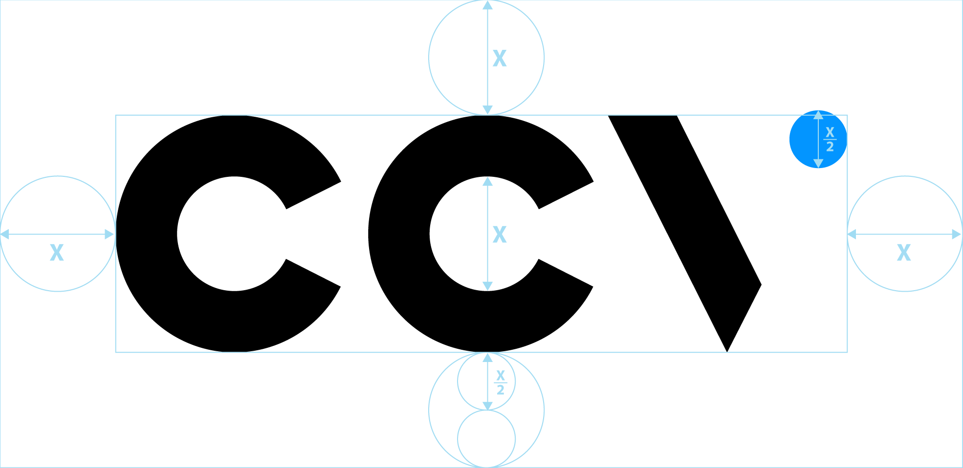
Primary logo
The new logo is more readable and easily adaptable to both vertical and horizontal formats, whether for digital use such as websites or for print.

Vertical logo

Horizontal logo

Headline
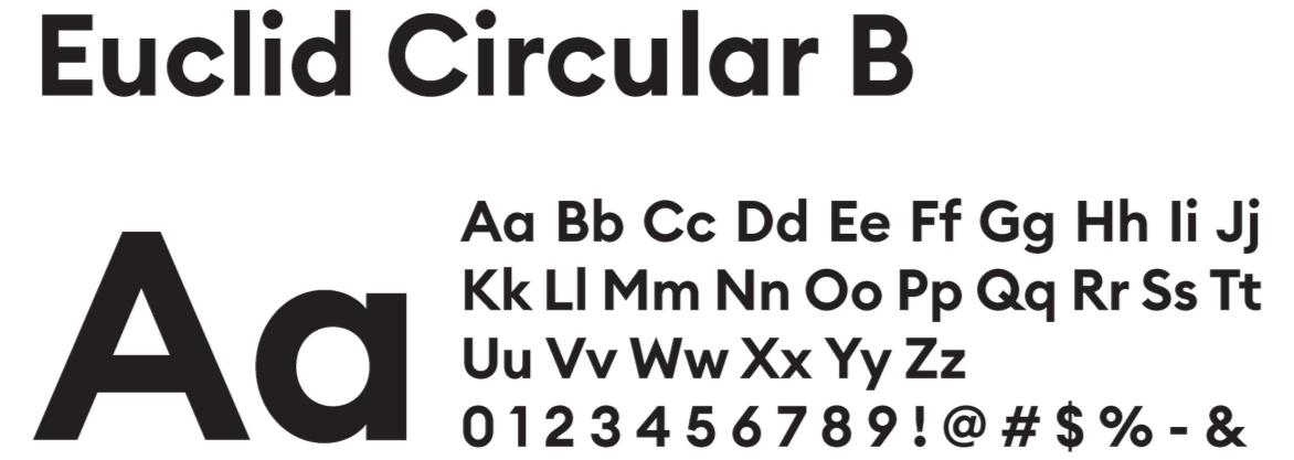
Body text

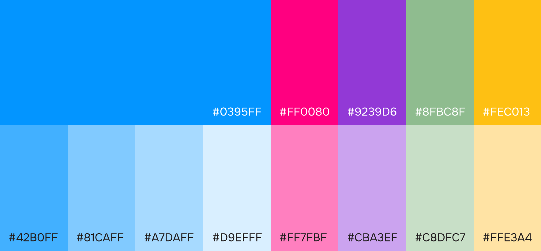
Colour palette
Shapes
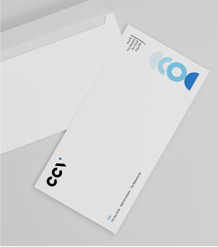
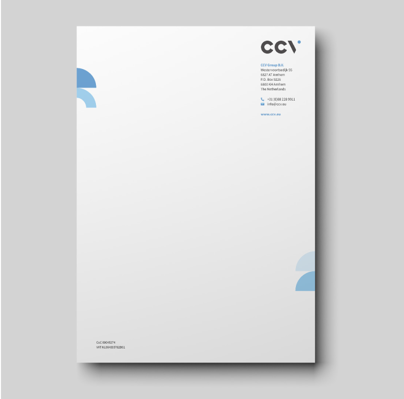
Stationary & Vehicle

This project require close collaboration with cross-functional teams within the company as well as with international agencies, and merchandise suppliers.


Hoodie


Packaging
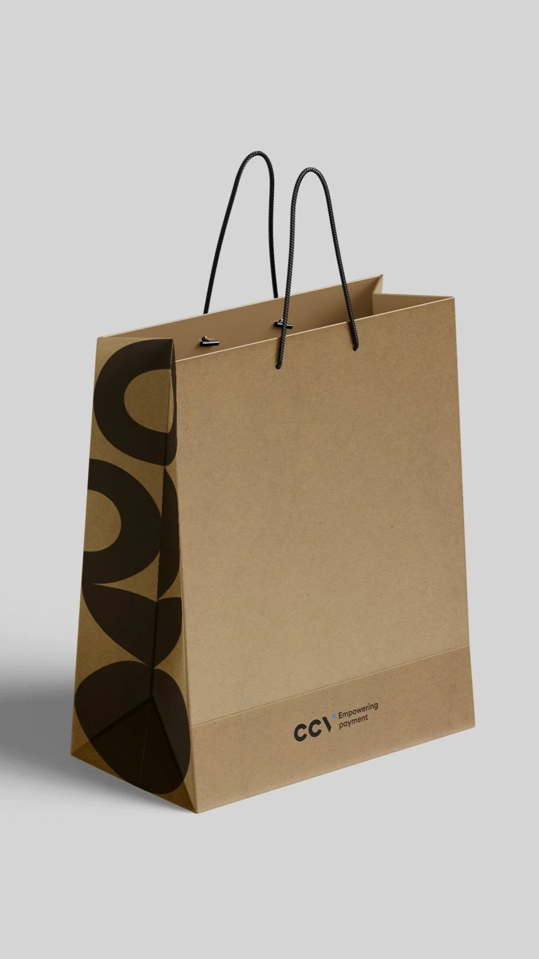
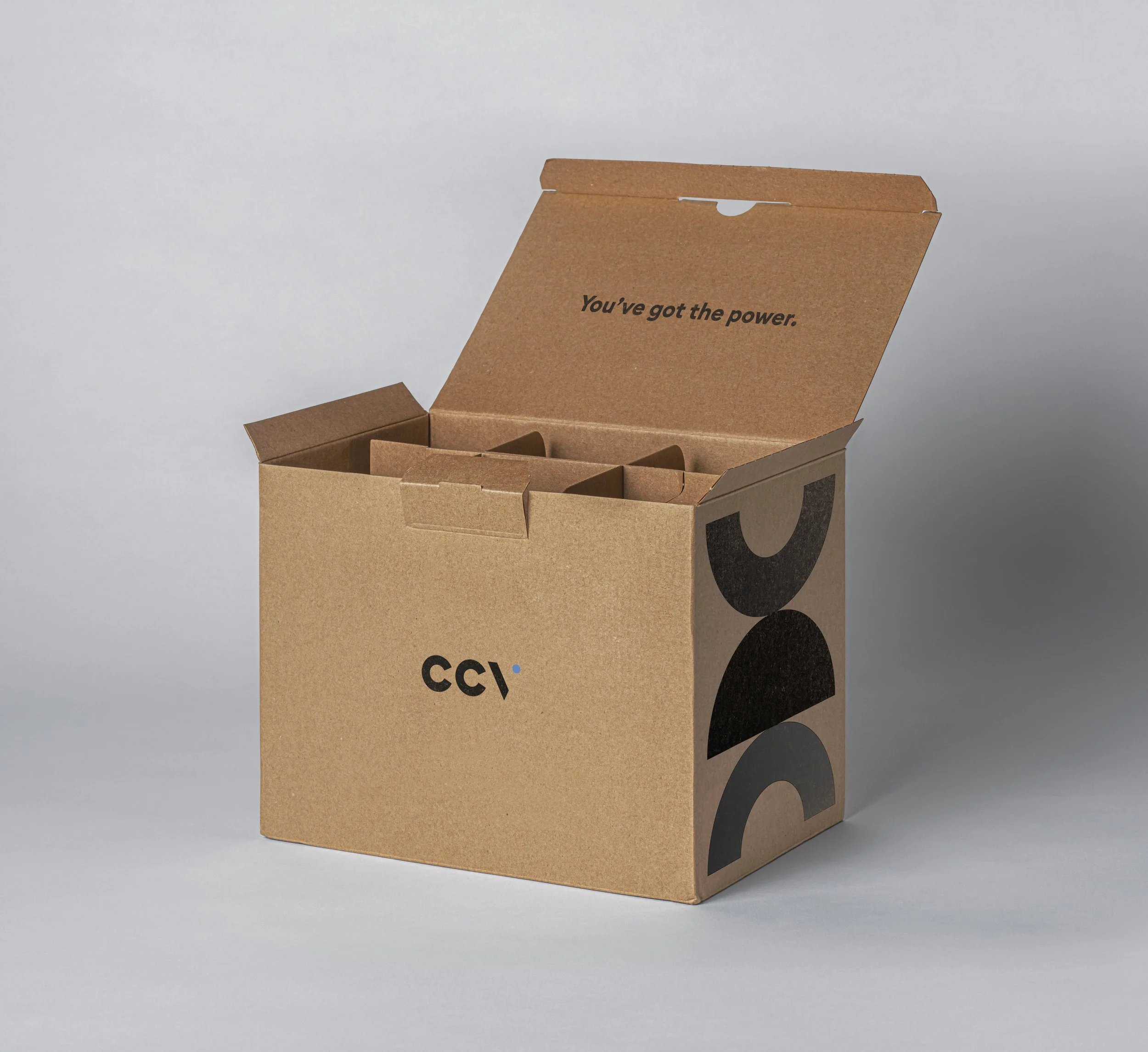
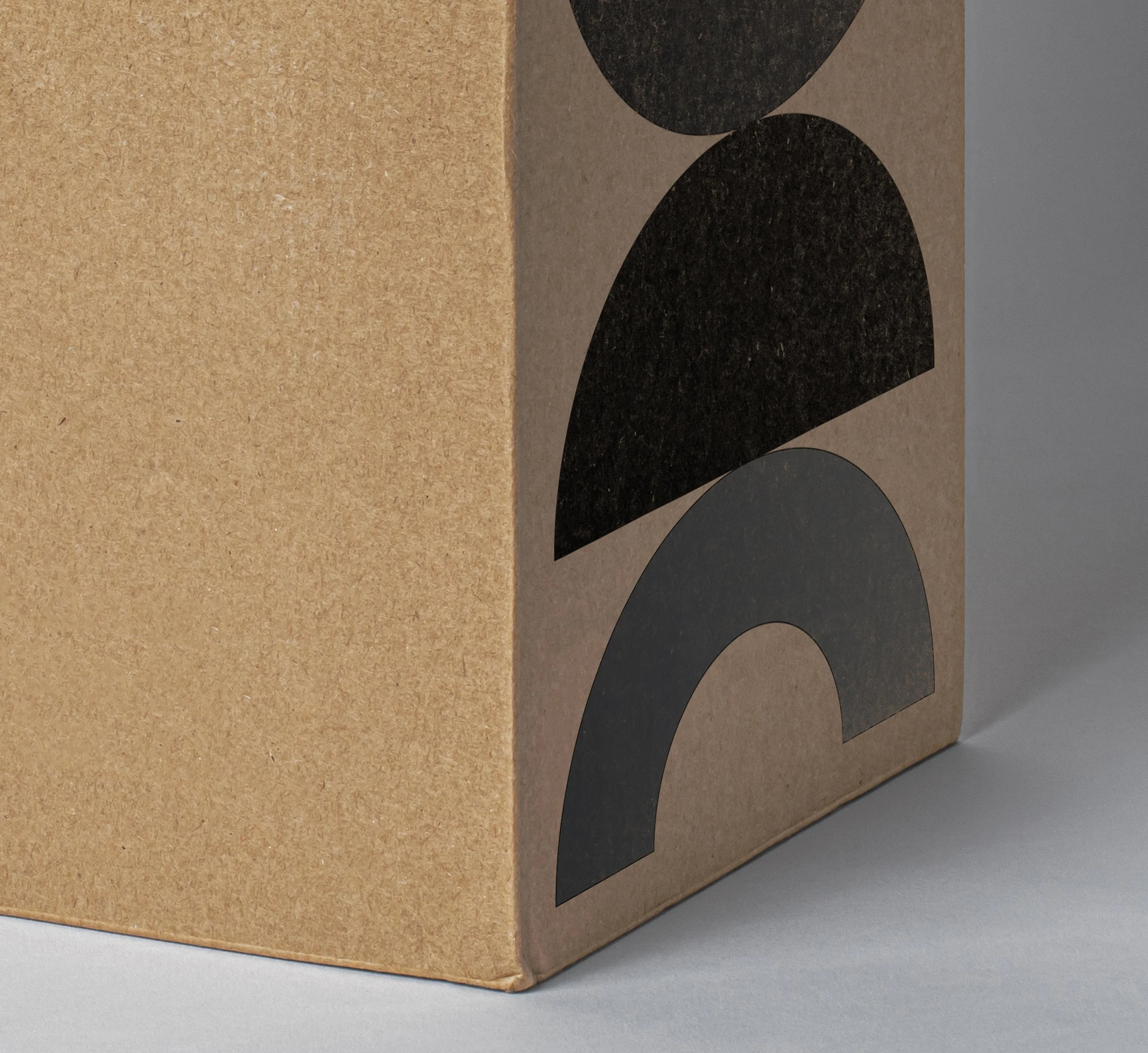
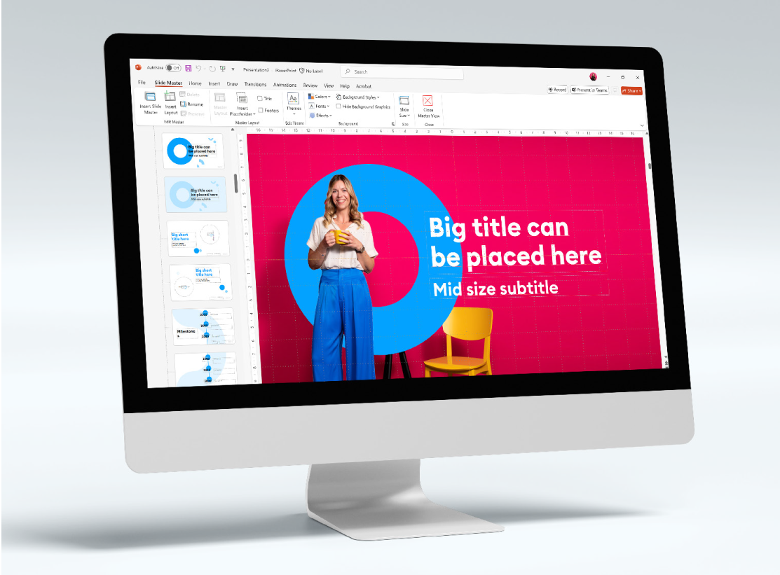
By dividing the circle and transforming it into a doughnut form, variations such as halves, quarters, and segments are created.
These modular elements provide flexibility in layouts while maintaining a cohesive and recognisable visual identity.


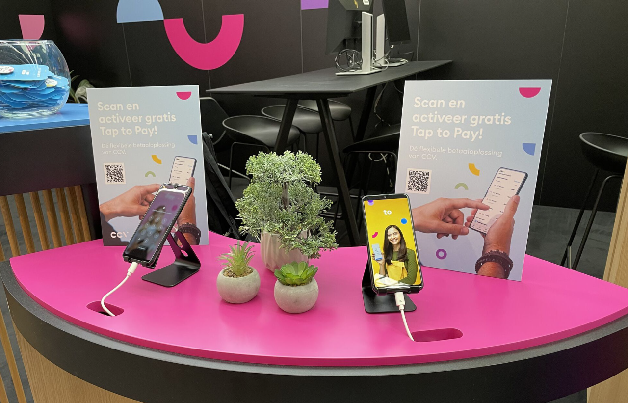
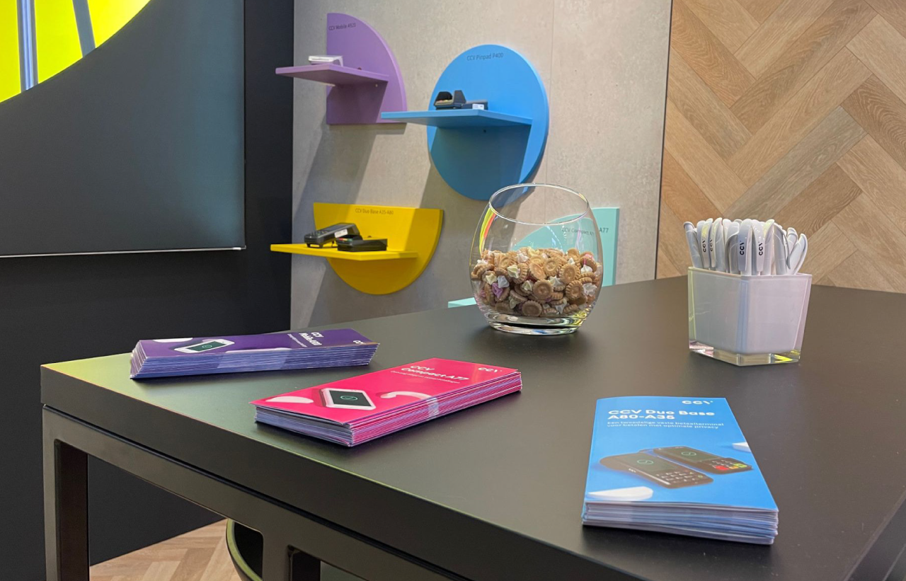
Booth design


Digital & Print template


The results